TLDR; use jolly-ui with shadcn to get shadcn styles with react aria components
In this article we will explore shadcn ui library, its unique approach to components, drawbacks to its current approach and how to fix them by using react aria library in conjunction with it.
Shadcn UI library
Shadcn is a UI component library designed to help developers create websites quickly with special emphasis on accessibility. It provides a collection of pre-styled components that can be easily integrated into your projects.
It takes a bit different approach from other UI libraries in the sense that components are added to your code instead of acting as dependency. If you look at your 'package.json' you will not find any dependency added to it when you install shadcn. You can directly copy/paste components from shadcn or you can use cli that automates this process for you, either way components become part of your code. This approach provides maximum customization and independence from updates, ensuring your design remains consistent.
So what's the rationale behind this choice? Well, for one, it avoids any downstream issues that can crop up when a UI library updates with breaking changes. Your copies of the component code are essentially frozen at the version you copied. You don't have to worry about an update causing issues or refactoring your code.
Additionally, this model gives you flexibility. You can easily tweak the components' markup, logic, and styles to suit your unique needs without running into overriding issues. The code is yours to mold. This has a bit of downside as well, since your changes diverge with shadcn and updates to shadcn needs to be merged manually.
Underneath Shadcn, Radix UI powers the interactive components. Radix UI is a low-level component library that focuses on accessibility and customization. It provides unstyled components that can be styled according to your needs. Shadcn adds its own styles on top of it and gets accessibility for free. Some shadcn components use other libraries as well but most of the components rely on radix-ui
Radix-UI has some drawbacks too which because of dependency become drawbacks of shadcn
-
Unintutive code style
Take a look at example below
<Dialog>
  <ContextMenu>
    <ContextMenuTrigger>Right click</ContextMenuTrigger>
    <ContextMenuContent>
      <ContextMenuItem>Open</ContextMenuItem>
      <ContextMenuItem>Download</ContextMenuItem>
      <DialogTrigger asChild>
        <ContextMenuItem>
          <span>Delete</span>
        </ContextMenuItem>
      </DialogTrigger>
    </ContextMenuContent>
  </ContextMenu>
  <DialogContent>
    <DialogHeader>
      <DialogTitle>Are you absolutely sure?</DialogTitle>
      <DialogDescription>
        This action cannot be undone. Are you sure you want to permanently
        delete this file from our servers?
      </DialogDescription>
    </DialogHeader>
    <DialogFooter>
      <Button type="submit">Confirm</Button>
    </DialogFooter>
  </DialogContent>
</Dialog>
Contextmenu needs to be wrapped around dialog if it is required to be activated from context menu. This is unintutive and while there are sound reasons of why this is the case it still adds to developers inconvenience.
- Lack of basic features: If you want to add "multiselect" you are on your own, neither radix-ui nor shadcn provides multiselect functionality in its component. Argument is its not easy to do it in "accessible" way so most developers end up doing it by themselves in non-accessible ways. These limitations require additional custom development or integration with other libraries to fill the gaps.
-
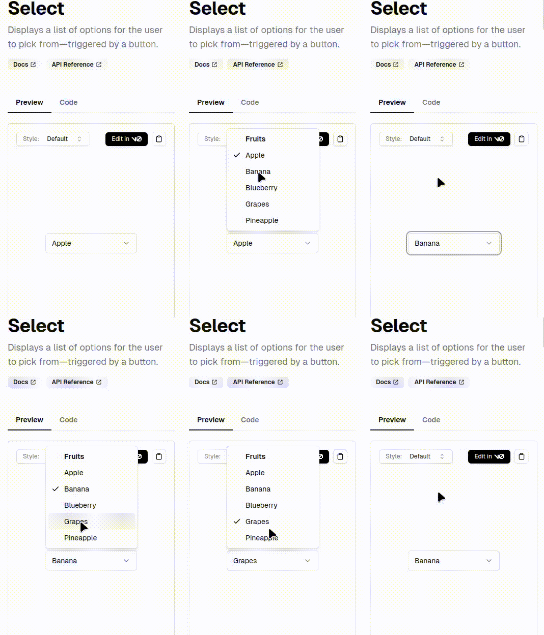
Usability issues on mobile/touch based devices Take a look at this image of select component on mobile. You need to touch twice to select a field. It almost feels like mobile/touch was afterthought.

Using react aria with shadcn ui
React Aria, developed by Adobe, is another headless component library similar to radix-ui that is ARIA compliant and focuses on covering range of devices such as desktop/mobile/touch enabled devices in accessible way. It has better support on mobile and code is developer friendly as well. Like radix-ui components are unstyled and can be styled according to your design.
Jolly-ui: shadcn style with react aria
Jolly-Ui is a new library that leverages React Aria under the hood while utilizing Shadcn styles. Jolly-Ui takes a similar approach to Shadcn, where code is copied into your project instead of adding it as a dependency. This method ensures that you retain full control over your components while benefiting from the accessibility features of React Aria.
Jolly-Ui focuses on modifying the interactive components of Shadcn, such as buttons, dialog, and modals, to enhance accessibility using React Aria. The display components of Shadcn, like cards and typography, are used as-is, maintaining the visual appeal while improving interaction accessibility.
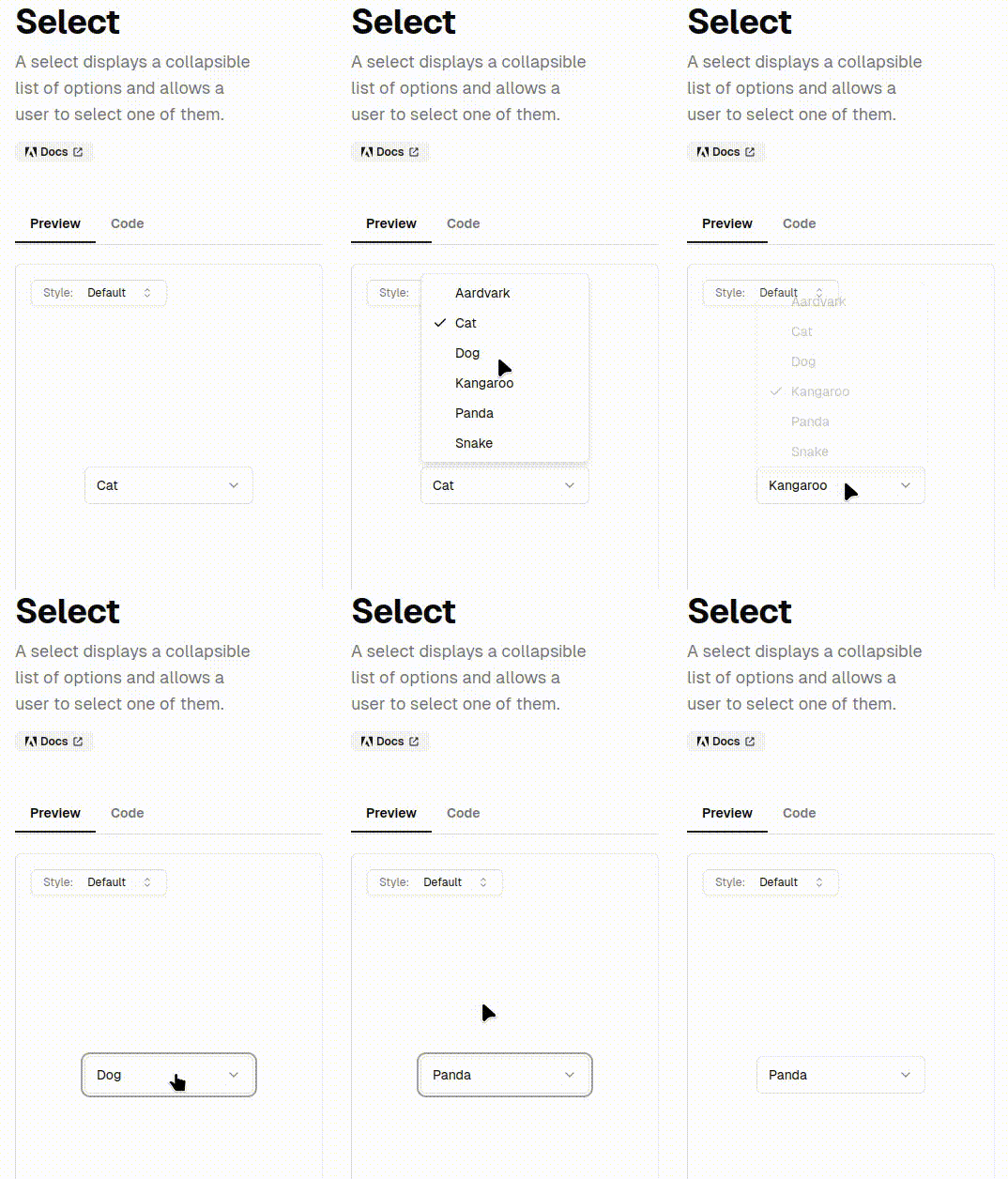
Lets see same select example with jolly ui

Other alternatives for using react aria with tailwindcss
While Jolly-Ui is great for compatibility with shadcn there are other ui libraries as well that use react aria under the hood. You are not limited to using Jolly-Ui. Here are some of the other alternatives
- Draft-UI - This takes similar apporach to Jolly-Ui components in this library are part of your code however it does not adheres to shadcn styling.
- Baselayer - This provides vscode extension and also advocates for using vscode as primary mode of development. This approach makes things easy if you are uisng vscode but you have to be really motivated to use this library if you are not using vscode. You can still refer to the code to fill in the gaps for components in react aria which are not to your liking in tour current library.
- Adobe starter kit - There is also a version of components provided by adobe itself. You will have to copy these components in your codebase and support is limited. I am not sure if its maintained either. It could be there just as a proof of concept.
- DotUI - Dotui is relatively new library in town and it also takes the approach of copying code to your codebase to use it however it does not provides easy way to di it via automatic copying of components as done in Jolly-Ui so you have to do it manually but it may change in future
- D - This is another library that internally uses react-aria and tailwind. It also takes the same approach of copying components to your codebase but has nice cli to automate the process.
- NextUI - Nextui is conventional library in the sense that it uses node modules so you can use it as any other ui framework library and upgrading is simple with single command. It also used react aria underhood and is open source so you can use it to fill in gaps if you are using some other library for styling.
Conclusion
If you are using shadcn and want better support for touch enabled devices add jolly-ui on top of shadcn to utilize react aria components with shadcn style.

